

How to Create/Use the Geo Heat Map in Excel
Heat maps in Excel are available for different countries. It provides a good demonstration of where the concentration of sales data is geographically located.
Data Function Explanation:
Geo Heat Map: This function is used to create a visualization of the concentration of data by geographic location.
Example:
The Financial Analyst received data exported from the company’s e-commerce database containing sales quantities by State. The Financial Analyst prepares a weekly sales deck to update management of where the company’s products are most popular across the USA.
The Financial Analyst should, therefore, create a heatmap to show sales representation levels by State.
Steps:
1. Navigate to Developer, Add-Ins, then install the Geographic Heat Map.
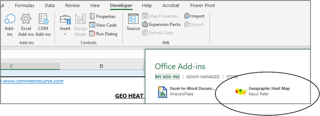
2. Once installed go to the Add-In and click “Add” to bring the heatmap I-frame into the Excel.
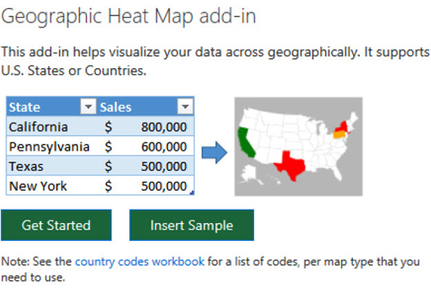
3. Click Get Started.
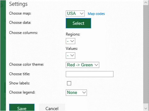
4. Configure settings by choosing the data and map type (e.g. USA). Select a color scheme.
Example Raw Sales Data and Heat Map (Below):
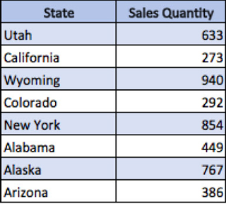
When selecting data choose the data figures you’d like represented in your heat map.
Heat Map:
Note you can also right-click and change the color scheme.
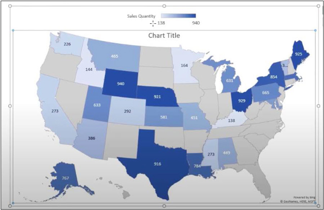
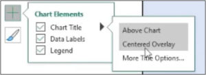
Chart Title:
The Heat Map plugin allows for chart element customization. You can go through each of the chart title options and decide where to present it on the map.
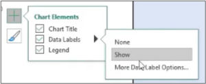
Data Labels:
The data labels can be shown or removed, and added options are available for customization.
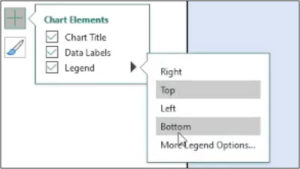
Legend:
You can also decide where you’d like to present the legend on the heat map.
It is a fairly customizable plugin that is available within Microsoft Excel if you go to the add-ins and added it to your workbook. It makes for a great visual representation from a sales perspective if you’re updating things like sales figures throughout the week or throughout the month and you would have to make a presentation for that sort of data.
It is highly recommended to becoming familiar with it so that you can incorporate it into your reporting.
I hope that helps. Please leave a comment below with any questions or suggestions. For more in-depth Excel training, checkout our Ultimate Excel Training Course here. Thank you!


0 Comments