

How to Use the Sales Funnel Chart in Excel
The sales funnel chart is a common chart to illustrate sales pipeline and its conversion metrics from initial lead to the closed/won stage.
Example:
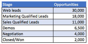
A Financial Analyst has the sales opportunity data for the month of November 2020 in the below raw data table.
The Financial Analyst would like to represent the sales funnel information in a sales funnel chart for the upcoming sales meeting.
Raw data:
Solution:
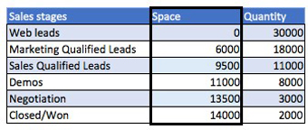
1. Insert a column named ‘Space’ between the Sales stage and Quantity in order to get the funnel shape on the chart.
Make the space formula equal to: (Funnel high end quantity – funnel reference quantity) / 2. E.g. demos space = (30,000 – 6,500)/2 = 23,500 / 2 = 11,750
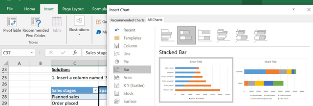
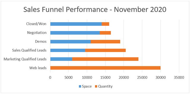
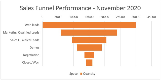
2. Select the entire table and insert a Stacked Bar Chart.
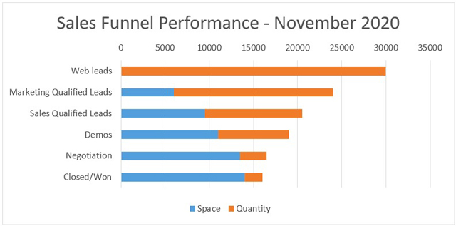
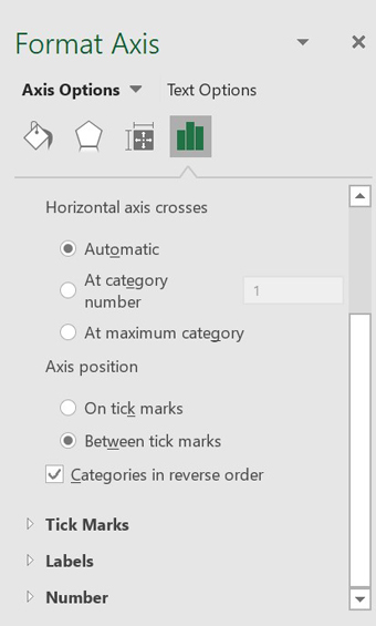
3. Select the categories, then select format axis, and convert them into reverse order.
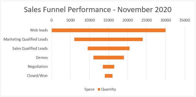
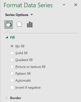
4. Select the Space (blue) portion in the chart, and change the color into No fill.
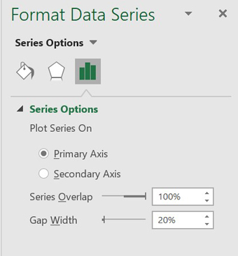
5. Select the data series, and decrease the Gap Width to 20%.
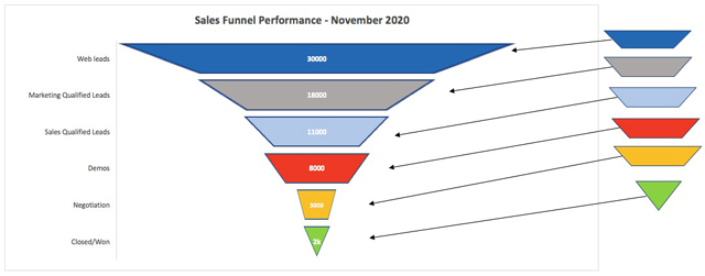
6. Make, copy, and paste four corner flowchart shapes of different colors in the first five data series and a reverse triangle flowchart shape in the last data series.
You can customize the look by adding data labels to the sections, removing the top x-axis quantity bar, removing grid lines behind sales funnel, and removing the legend which is not necessary.
The only thing you need in creating a sales funnel chart in Excel is the raw data of the stages and number of opportunities within each stage and you just need to insert a space column between each of the two columns that already exist in the sales stages in the quantity. Then, making it equal to the difference between the top end of the funnel, the current stage of the funnel and dividing that by 2.
I hope that helps. Please leave a comment below with any questions or suggestions. For more in-depth Excel training, checkout our Ultimate Excel Training Course here. Thank you!


0 Comments