

How to use the Timeline Chart in Excel
A timeline chart shows the milestones of a project in a graphical presentation. Excel doesn’t yet offer a timeline as a chart type. Instead, in Excel, we are able to create a timeline chart by customizing the scattered chart type. To create a timeline from a given dataset we need to execute the steps noted below.
Example:
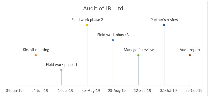
We have prepared a financial statement audit timeline from start to finish. The Partner of the audit engagement has requested that we present the plan at our kickoff meeting and show the project timeline in a timeline chart.
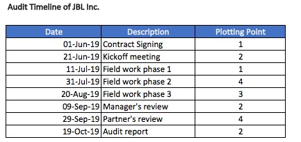
Plotting point is the point where we want a milestone to show on the graph. For a professional-looking timeline it is important to have different plotting points for consecutive milestones.
Steps:
1. Select the data range containing date as X-axis and plotting point as Y-axis.
2. On the Insert tab, in the Charts group, click the scatter chart symbol.
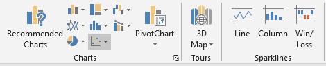
3. Click Scatter chart
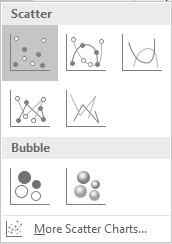
4. The result is a scatter chart, which we’ll customize to create a timeline for the project.
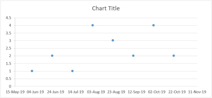
5. Enter the title by clicking on the Chart Title and typing a new name.
6. Click on the + sign adjacent to the chart and un-check the gridlines option.
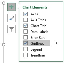
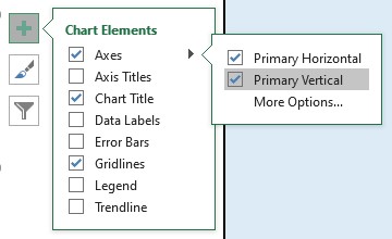
7. In the same menu, go to Axes and un-check the primary vertical axis, as we don’t want the plotting points to show on our timeline. Also, check the “Data Labels” & “Error Bars”.
Result:
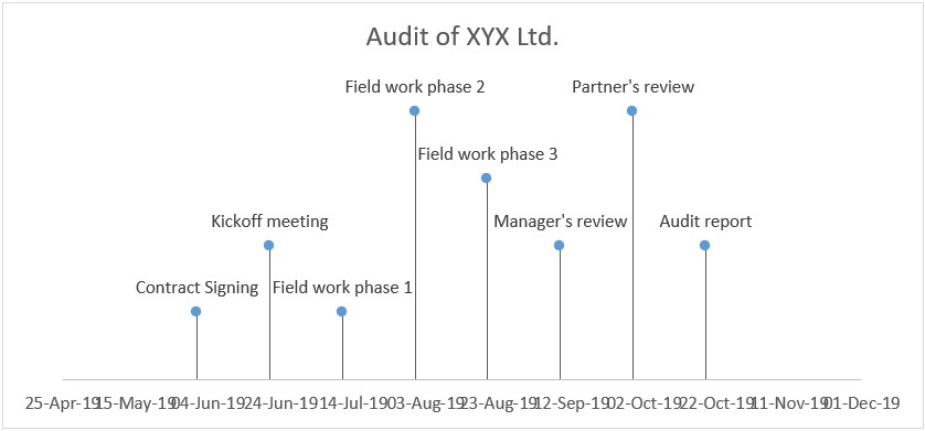
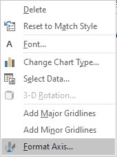
8. We don’t want the horizontal error bar lines. So we remove them by following these steps.
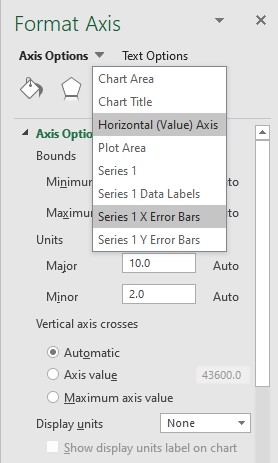
Right-click on the dates (x-axis) and select format axis.
In the Format Axis menu, open the dropdown options on “Axis Options” & Select “Series 1 X Error Bars”.
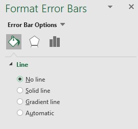
Click on the bucket icon and select No Line.
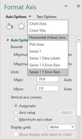
In the Format Axis menu, open the dropdown options on “Axis Options” & Select “Series 1 Y Error Bars”.
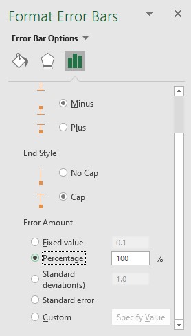
Click the columns symbol, select the direct as Minus, and error amount percentage as 100%.
Result:
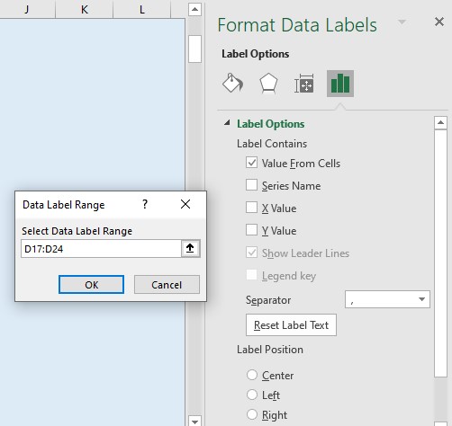
9. Instead of showing the plotting points as milestones, we want the actual text of milestone to show in our timeline.
In order to do this:
- Go to Axis Options again and select “Series 1 Data Labels”.
- Click on the Columns symbol. Uncheck Y value
- Check value from cells and give the desired range.
10. Customize the color scheme and date range to make the timeline look more professional. This can be achieved by double-clicking on the bars and using a pre-set template from the top menu which appears under chart design. Additional customization can be done with the right navigation pane.
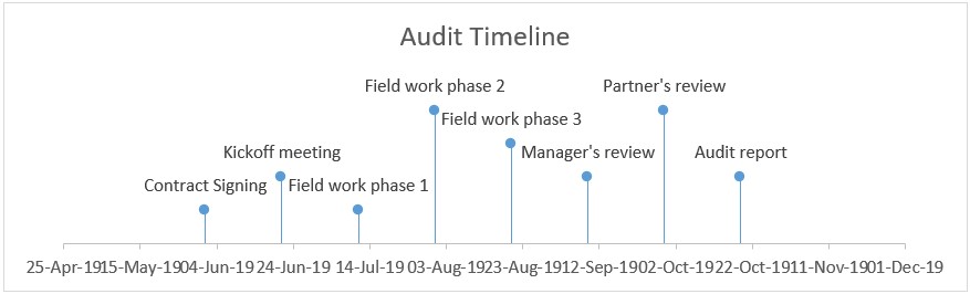
There a lot of options such as changing the lines, colors, adding grid lines and so forth on the navigation pane
I hope that helps. Please leave a comment below with any questions or suggestions. For more in-depth Excel training, checkout our Ultimate Excel Training Course here. Thank you!


0 Comments