

How to Use the Timeline Gantt Chart in Excel
A Gantt chart in Excel breaks down the structure of a project into different milestones and presents in a graphical form, including the start and finish dates.
Excel doesn’t yet offer Gantt as a chart type. In Excel, we are able to create a Gantt chart by customizing the stacked bar chart type. To create a Gantt chart from a given dataset, we need to execute the below steps.
Example:
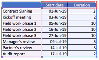
We have prepared a financial statement audit timeline from start to finish. The Partner of the audit engagement has requested that we present the plan at our kickoff meeting and show the project timeline in a Gantt Chart.
Steps:
1. Select the data range, which is C16: E24 in our examples
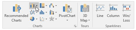
2. On the Insert tab, in the Charts group, click the Column symbol.
3. Click Stacked Bar.
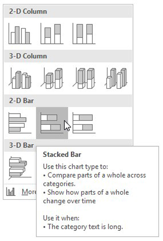
4. The result is a bar chart, that we’ll customize to get a Gantt chart.
5. Enter the title by clicking on the Chart Title and renaming it.
6. Click the legend at the bottom and press Delete
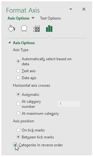
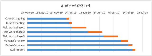
7. The milestones are in reverse order. To correct the order, right-click the milestones on the chart, click Format Axis, and check “Categories in reverse order”.
Result:
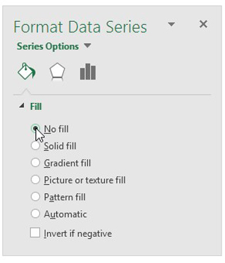
8. Right-click the blue bars, click Format Data Series, Click Fill & Line Icon, Select NO Fill.
9. To adjust the blanks on the start and end of our Gantt Chart, we need to adjust the dates.
Right-click the dates on the chart, click Format Axis, and fix the minimum and maximum bounds to the nearest dates.
01-Jun-19 43617
17-Jul-19 43663
Select the Major units as 7.
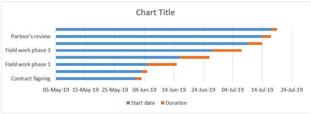
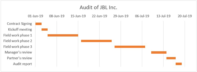
10. Result – Gantt Chart for Project “Audit of JBL Inc”
This is the GANTT Chart that I decided was an appropriate style after some customization. You are going to have a copy of this workbook to be able to see how it is set up in the steps that are outlined in this lesson.
In a matter of 5 minutes, or so you can create your own Gantt timeline chart for your own project management and then customize the look and feel of it as you see fit.
You can start implementing this into your project management activities going forward!
I hope that helps. Please leave a comment below with any questions or suggestions. For more in-depth Excel training, checkout our Ultimate Excel Training Course here. Thank you!


0 Comments