

How to Use the Win/Loss Sparklines Chart in Excel
A win-loss chart shows positive and negative values with different colors in a single cell. The win-loss chart assists with the visualization of trends in data.
It shows an upward-facing marker for positive values and a downward-facing marker for negative values. Zero values get no marker.
Example:
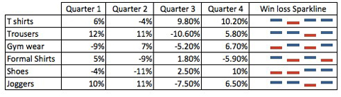
We have data in the below table relating to the percentage change in the sales of different products for the year.
The data is arranged in quarterly columns and we want to add a win-loss sparkline chart for each quarter.
Solution:
1. On the Insert tab, in the sparklines group, click on the win/loss symbol.
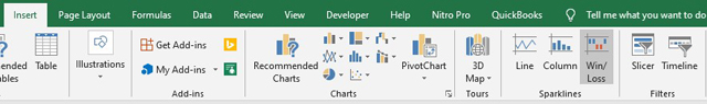
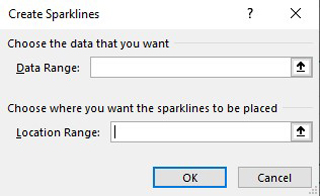
2. A create sparklines dialog box is opened. For the data range, select the data from the table that you’d like to create the chart based on.
For the location range, choose the cells where you’d like the chart to be placed.
3. Result:
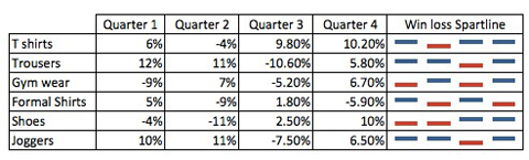
So this is how you use the Win/Loss Sparklines chart in Excel and you can use it in your financial analysis going forward to represent data.
I hope that helps. Please leave a comment below with any questions or suggestions. For more in-depth Excel training, checkout our Ultimate Excel Training Course here. Thank you!


0 Comments