

How to Use the Bar Chart in Excel
A bar chart is the horizontal version of a column chart. Using a bar chart in Excel is recommended when we have large text labels.
Example:
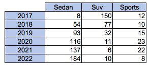
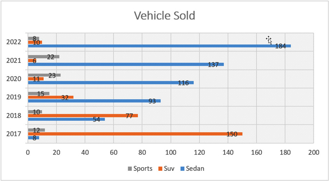
We have a quantity of car sales data in the below table which we would like to present in a bar chart. We would like to portray the timeline (years) and the category of vehicles with the sales data used as the column width.
Solution:
1. Select the data range of the table above.
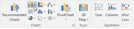
2. On the Insert tab, in the Charts group, click on the Column symbol.
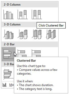
3. Click the type of chart you want, in this example, we selected Clustered bar.
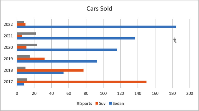
4. Result:
5. Customizing the bar chart can be achieved by double-clicking the bars, and choosing a predefined template in the top menu. Additional customization can be achieved through the right pane.
Overall, creating a bar chart is very easy in Excel. You just need to select the data and then use the top navigation pane to insert a chart and select the bar chart that you want and then you can spend some tie customizing the look and feel of how you want it portrayed.
I hope that helps. Please leave a comment below with any questions or suggestions. For more in-depth Excel training, checkout our Ultimate Excel Training Course here. Thank you!


0 Comments