

How to Use the Column Chart in Excel
Column charts are used to compare values between categories by using vertical bars for presentation. Column charts are effective when there are two characteristics to support the analysis such as the timeframe of the data and the category of the data.
Example:
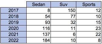
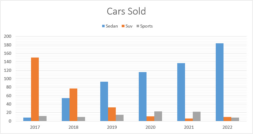
We have a quantity of car sales data in the below table which we would like to present in a column chart. We would like to portray the timeline (years) and the category of vehicle with the sales data used as the column height
Solution:
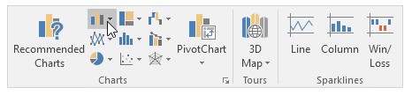
1. Select the data range of the entire table above.
2. On the Insert tab, in the Charts group, click on the Column symbol.
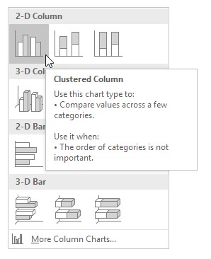
3. Click the type of chart you want, in this example, we selected Clustered Column which is best suited to our requirement, as we want a comparative view of vehicle sales by vehicle category.
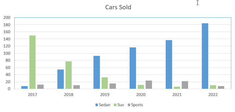
4. Result:
5. Customizing the chart:
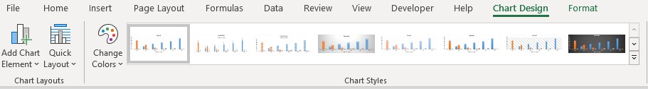
Double-clicking on the bars within the chart will open the below menu on the chart design tab. A variety of preset templates are available. See below for an example of one of them.
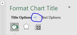
- Double-clicking on the background opens the format plot area which can be modified using the options on the right side menu.
- Additionally, there are many other options for customizing the chart by clicking the drop-down menu in the right sidebar and selecting an area of the chart to customize.
It is worth spending some time just customizing your bar charts and make them look how you feel are best suited for your presentation. The key is to make sure that you match the overall colors of the presentation that you’re creating.
For instance, if you are preparing a bar chart and there is already a presentation deck created by someone else in the company, you’re probably going to want to customize the colors and the look of your bar chart to be consistent with the theme of the presentation materials which have already been prepared.
I hope that helps. Please leave a comment below with any questions or suggestions. For more in-depth Excel training, checkout our Ultimate Excel Training Course here. Thank you!


0 Comments